Confidence Man Cover: From Pitch Deck to Final Print Images
This week, BRICKS Editor Tori West talks us through the creative direction process behind our Issue #13 The ‘Be Tender’ Issue cover story with Confidence Man and how the idea went from pitch deck to print cover.

The Inspiration
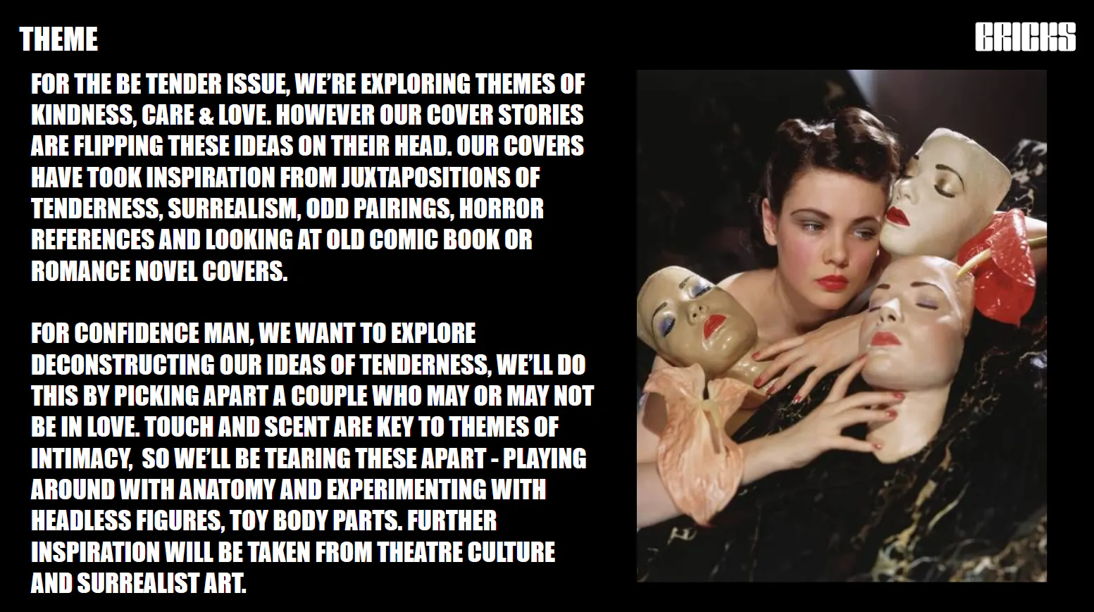
This issue theme was ‘Be Tender,’ and I think a lot of people would expect us to do a romantic, pastel-hued print. I wanted to take that expectation and flip it on its head so I took a lot of inspiration from horror aesthetics, tacky romance novel covers and campy theatre. Some of my favourite projects have been with talent who really embrace all the weird and wonderful aesthetics of fashion, which is why I was so excited to do the creative direction for our Confidence Man cover.
Here’s the initial concept I came with up…

The Deck
With pitch decks, it’s important to be extremely clear and concise. The majority of shoot proposals I receive for BRICKS solely focus on a specific mood or aesthetic rather than providing clear descriptions for each image that will be produced. Every single image that is placed on a deck should be purposeful, so only include imagery that will be directly referenced. There’s nothing worse than receiving a vague deck entirely plucked from Pinterest on the sole basis of it being aesthetically-pleasing. If I can’t find images to replicate my idea, I sometimes will add sketches (or bad Photoshopped mock-ups…). Additionally, I always add a small amount of text to each slide to explain each reference’s purpose and how we’d achieve the final shot.
Below, I have shared the selection of shot breakdowns I made for the Confidence Man proposal which you can later compare to the final images.
Please sign up to The Learner Platform to access the rest of this content. Subscribing helps support BRICKS as an independent publication.
START YOUR FREE TRIAL (Opens in a new window)
Already a member? Log in (Opens in a new window)

