New post overview: Your work moves to the foreground
We’ve redesigned the overview of your posts, so your project looks less like Steady and more like you.
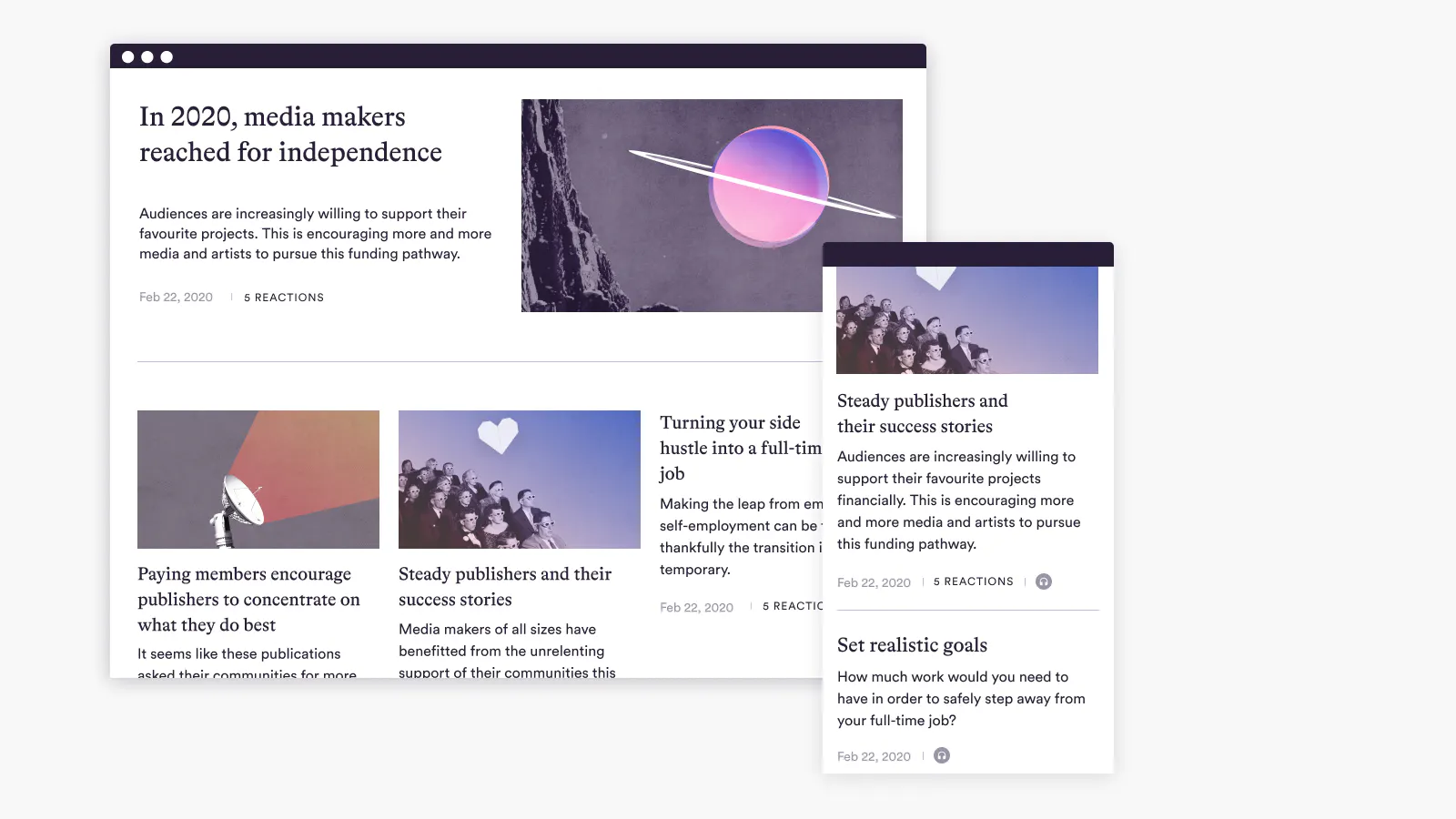
The overview page, where all your posts are displayed, is all new and shiny. Up till now, your posts were listed one below the other with only titles and teasers displayed. Now we’ve brought some life to this page.
New in your post overview
The overview page now looks less like Steady and more like you. At the top, the Steady logo and links to Steady’s pages have disappeared. Instead, you can see your logo and the name of your publication. Your logo appears at the bottom of the footer, too. Your legal notice is also linked here and Steady’s legal notice is no longer visible.
Each post is now displayed with a preview image. Of course, this means that each post should contain at least one image that can be used for the preview. We recommend adding a picture to every post, even those you have already published. It is crucial that you add a teaser image to each post (you can do this on the settings page of a post – it’s also possible to have a teaser image without the post itself having to contain any images).
Your most recent post will appear prominently at the top of the page.

The other posts appear tiled (up to 30 on one page).
Previously, exclusive posts (for people without access) were locked and could not be opened. Now, exclusive posts are previewed in the same way as freely accessible posts. Anyone can click on any post and open it. If a post is exclusively for members, the prompt to become a member will then appear.
In the preview, the post’s high-fives and comment count are no longer displayed. Instead, there is only one counter for all reactions (i.e. high fives and comments added together).
On the page with your project description and plans, the nine most recent posts are displayed at the bottom in the same style as on the overview page.
How to make your post overview just right
As mentioned above, each post is displayed with an image. To keep your overview looking great, check your 30 most recent posts and add an image to any posts that don't yet have one. (By the way, you can use a post’s settings page to check what its preview will look like).
Enter your legal notice in your publisher area (S'ouvre dans une nouvelle fenêtre), which will be linked in the footer of your Steady page. As a publisher on Steady, you are obliged to provide a legal notice. More information in our Launchpad (S'ouvre dans une nouvelle fenêtre).
You can now choose which landing page you prefer: What do you want visitors to see first when they visit you on Steady? The overview of posts or the page with your project description and membership plans? Make your selection (S'ouvre dans une nouvelle fenêtre) – it can be changed at any time.