Visualize financial data with beautiful Sankey diagrams

The analysis of financial data can quickly become very complex. This is where smart data visualization is helpful. It makes understanding the data easier.
Sankey diagrams are a special type of flowchart, typically used to visualize the flow of measurable resources. They draw the reader's attention because they explain complex data clearly. An intelligent choice of colors allows the reader to understand different flow quantities intuitively.
In this guide, we will show you how to create beautiful Sankey diagrams using Plotly. These diagrams are often used in the financial industry and are very helpful for visualizing financial statements.
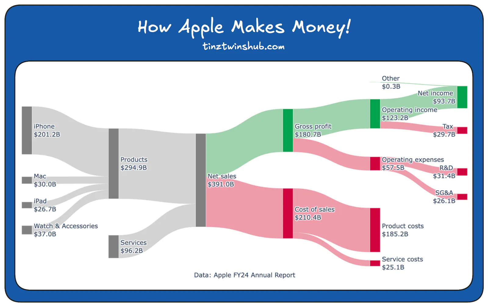
We guide you through the entire process, from retrieving data to creating impressive Sankey diagrams. This way, you can create Sankey diagrams like the one shown in the example below.
We will discuss the following points:
What is a Sankey diagram?
Key Terms
Strengths and weaknesses of Sankey diagrams
Use Cases
Technical requirements
Interactive Sankey diagrams with Plotly
Create a Sankey diagram of Apple's income statement
10-K filing: Data Access in Python
Extract Apple’s financial data from the 10-K filing
Sankey diagram “How Apple Makes Money?“
Conclusion
To read this post you'll need to become a member. Members help us fund our work to ensure we can stick around long-term.
See our plans (S'ouvre dans une nouvelle fenêtre)
Déjà membre ? Connexion (S'ouvre dans une nouvelle fenêtre)